Logo
Lockups
The Deblock logo is the most recognizable expression of our brand.
It stands for ownership, clarity, and freedom.
Simple by design, confident by nature, it reflects what Deblock is about: a new standard for money; clear, sovereign, and in motion.
Our logo should always appear with intention, consistency, and respect for its role as the anchor of the brand.
Symbol
Clear space
Horizontal lockup
Symbol lockup
Wordmark lockup
Here you can download our logos
Tagline description
“Own your money” is not a slogan.
It’s a statement of fact.
It expresses the core promise of Deblock: real ownership.
Not access. Not permission. Ownership.
With Deblock, money is no longer something you wait for, request, or justify.
It’s something you control; fully and directly.
Color usage
The logo should primarily be used in its core brand colors.
When color constraints apply, monochrome versions are available and must be used according to the defined rules.
The logo should never be altered, recolored arbitrarily, or placed on backgrounds that compromise contrast and legibility.
On images
When placing the Deblock logo on imagery, clarity always comes first. The logo must maintain strong contrast with the background to ensure legibility and impact.
Light logos should be used on dark backgrounds, and dark logos on light backgrounds.
Avoid placing the logo on busy, low-contrast, or overly textured areas of an image.
When necessary, use approved overlays or solid backgrounds to preserve visibility. Every placement should feel intentional, balanced, and unmistakably Deblock. See the following examples.
In partnership (horizontal lockup)
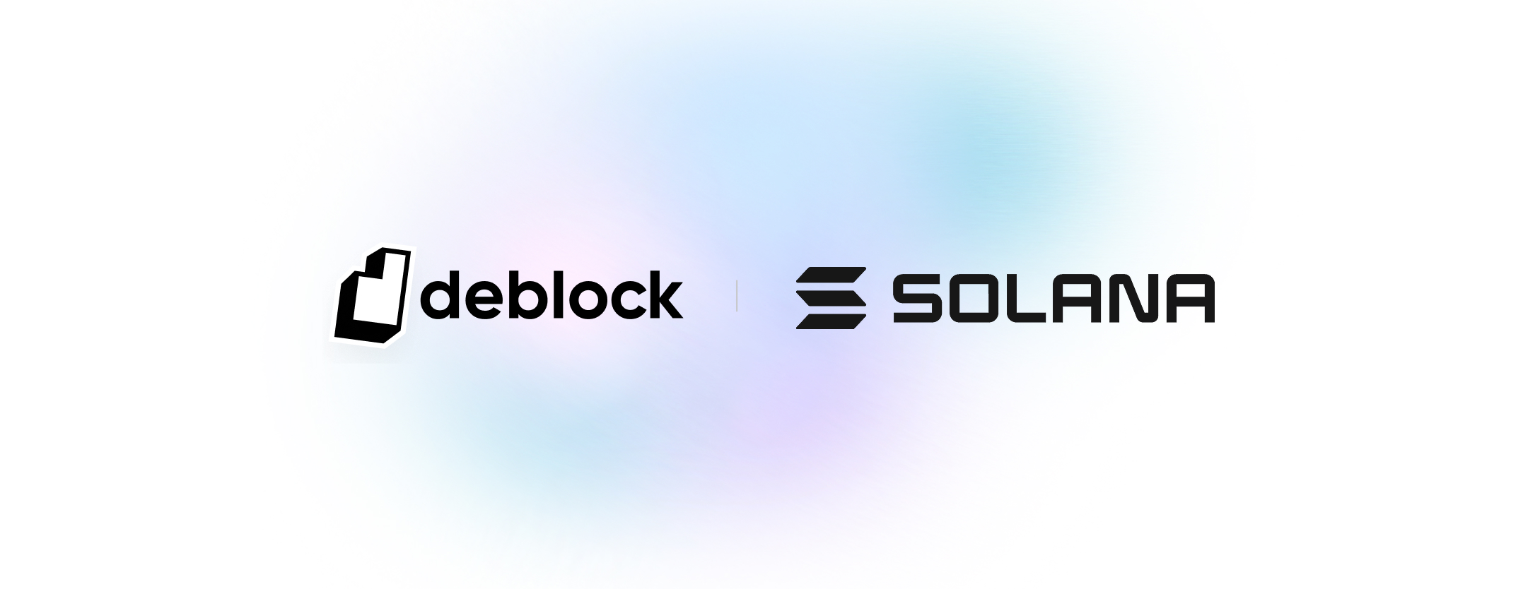
When the Deblock logo appears alongside a partner’s logo, both brands must be treated with equal respect and visual balance.
The partnership lockup is always horizontal and follows a clear, structured alignment.
Logos must be positioned on the same baseline, with consistent spacing to ensure readability and harmony.
Neither logo should dominate the other.
Size, weight, and visual presence must feel equivalent, regardless of brand familiarity or market strength.
The Deblock logo must never be altered, resized disproportionately, or visually subordinated to a partner mark.
Logo in use