Colors

Primary colors

Black and white are the foundation of the Deblock color system. They express clarity, confidence, and control. Everything else exists to support them.

Secondary colors

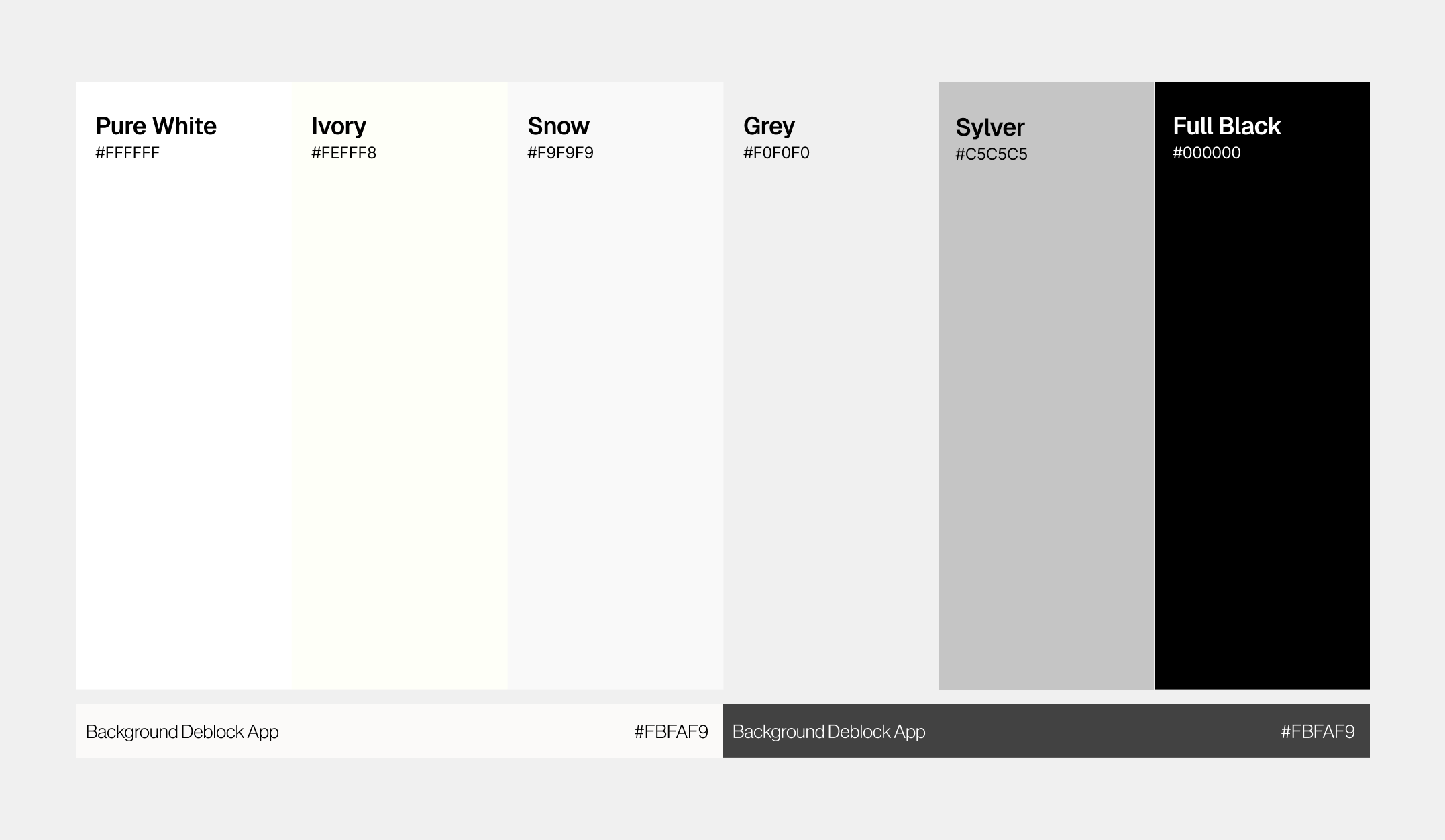
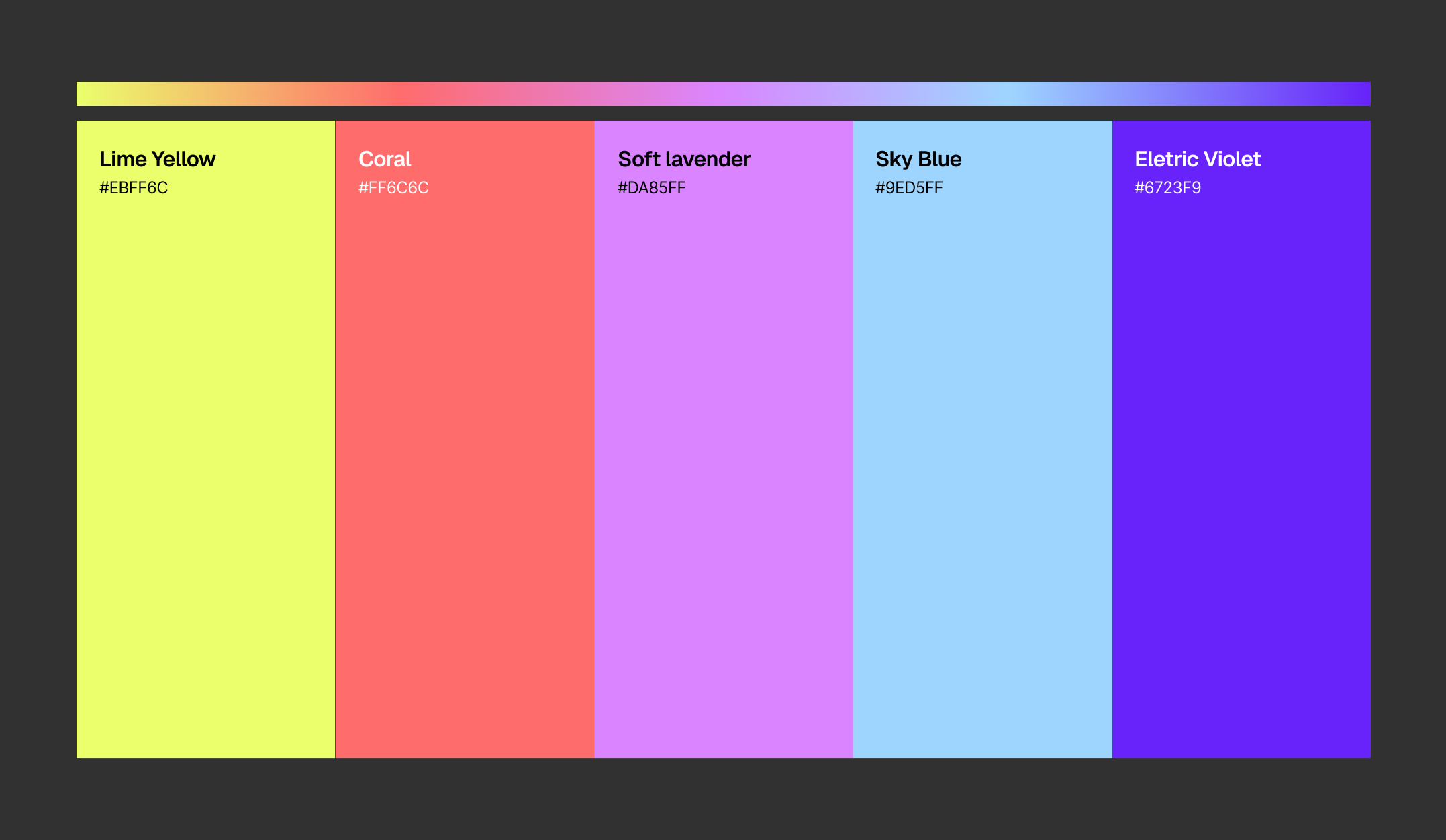
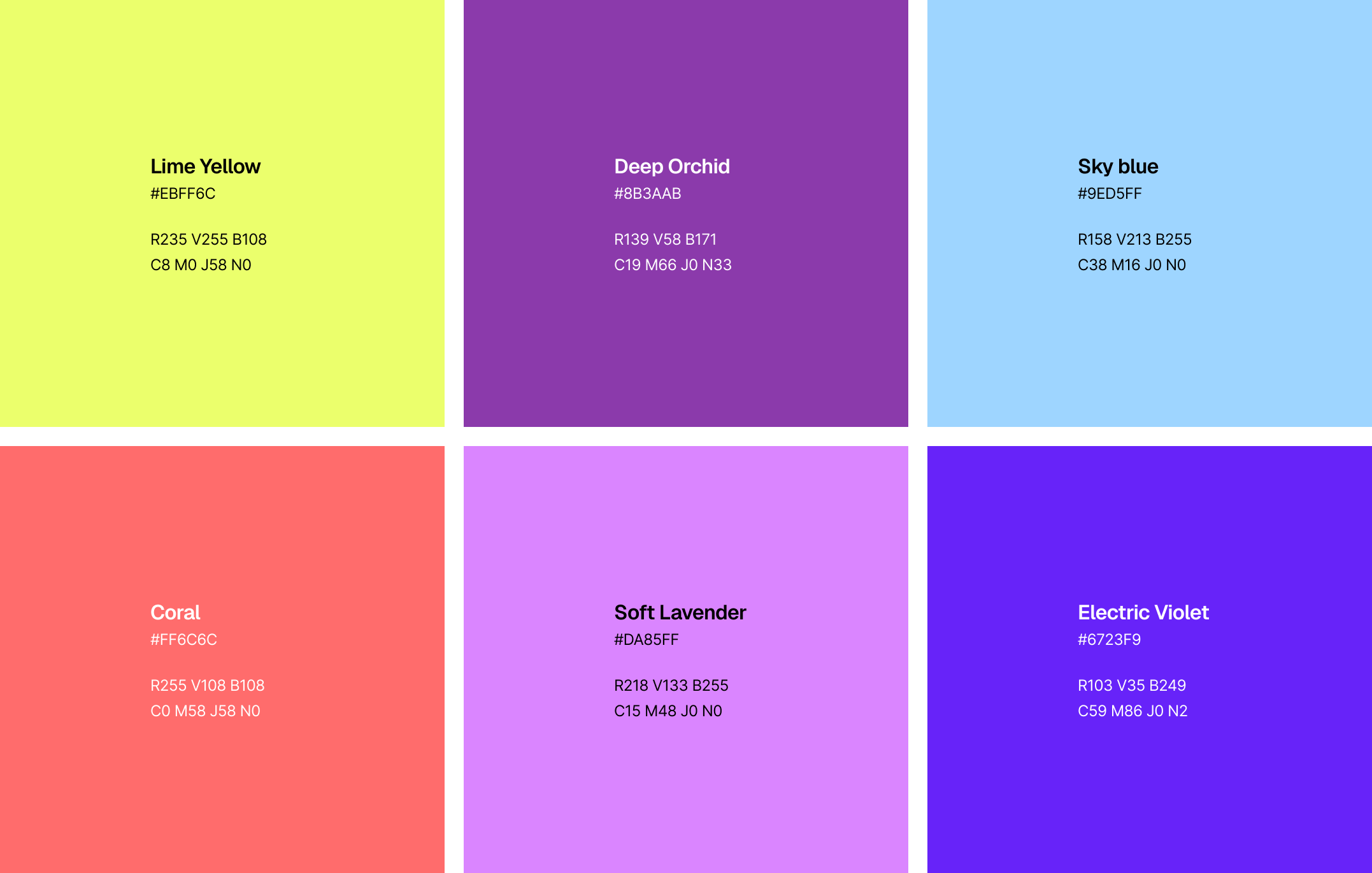
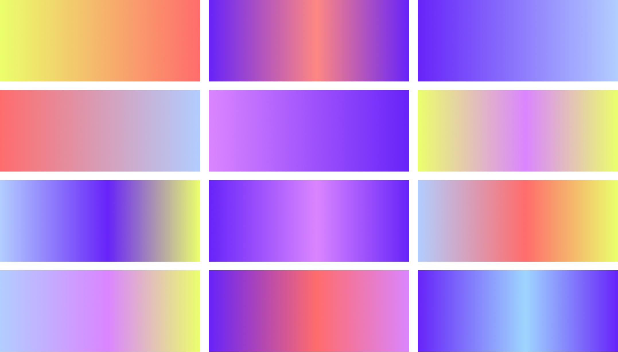
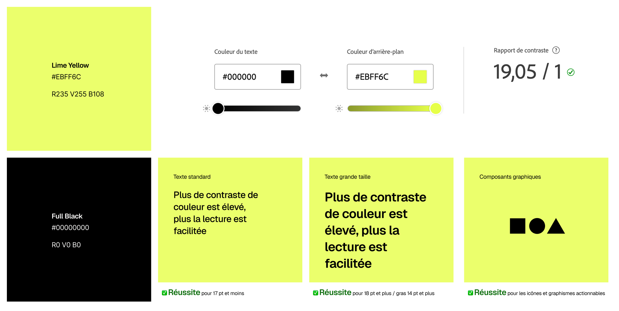
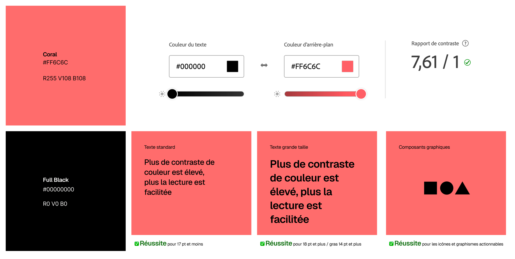
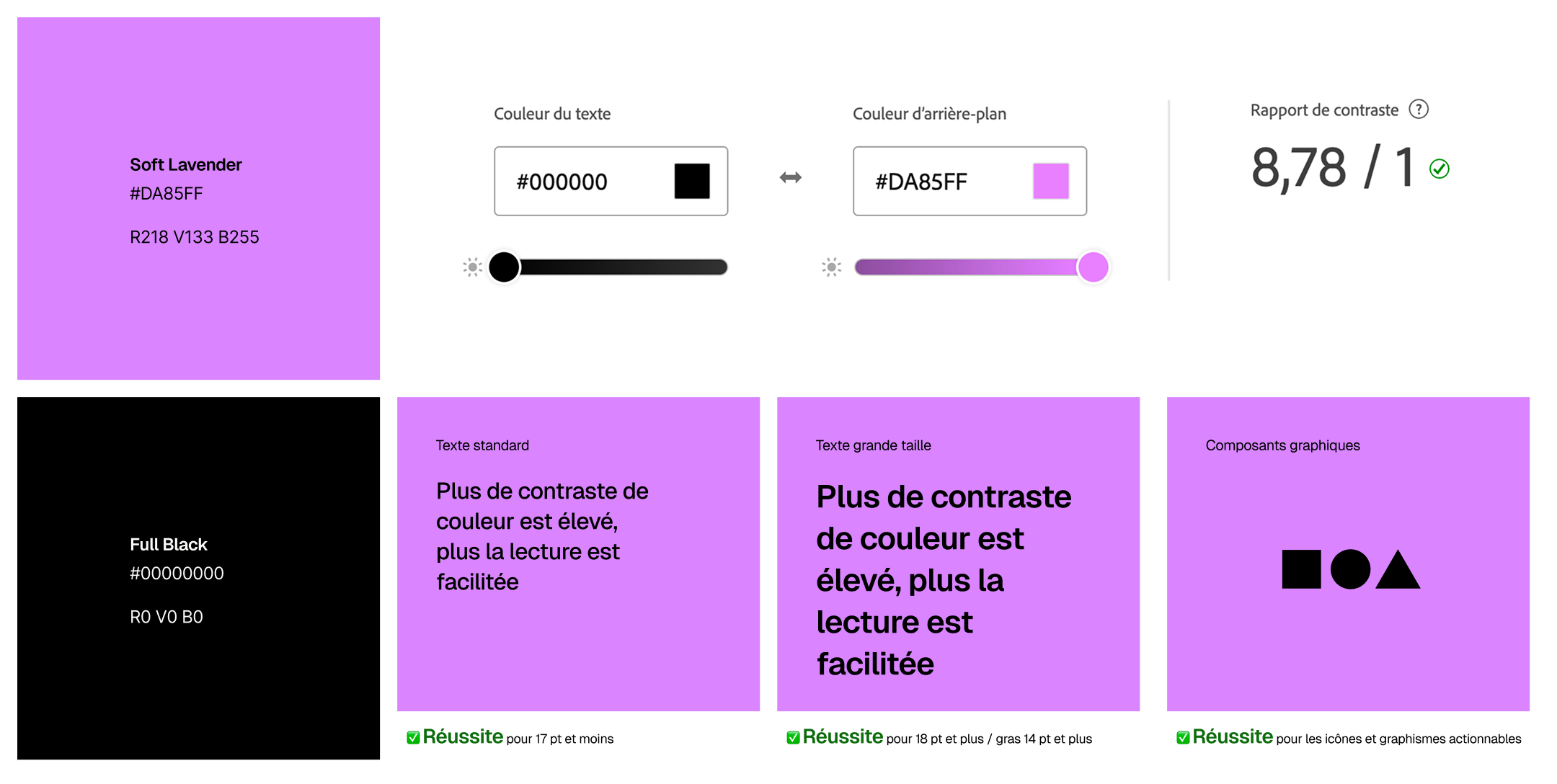
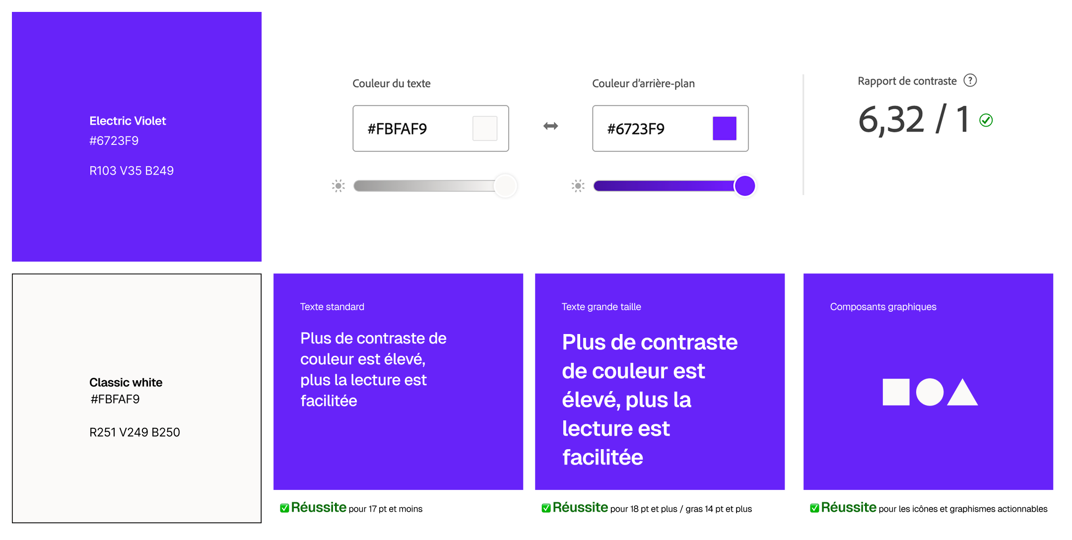
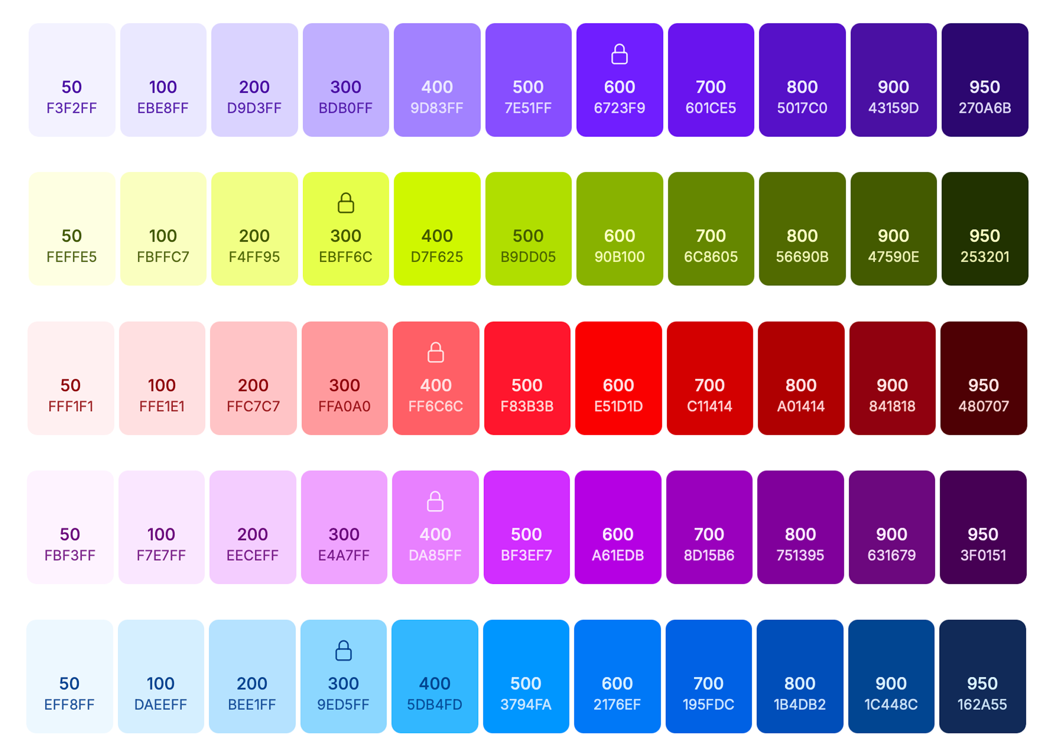
Deblock’s secondary palette brings energy and expression to the brand.

These colors are used to highlight moments, guide attention, and add rhythm across interfaces and campaigns.

Each color is bold, luminous, and intentional; never decorative.

They are accents, not foundations.

Gradients

Gradients are used to express movement and flow.

They reflect the circulation of money and the energy of the Deblock ecosystem.

Always smooth, vibrant, and controlled, gradients should feel dynamic without overpowering the content.

In use

Color usage is purposeful and restrained.


Black and white dominate layouts, while secondary colors are applied sparingly to create emphasis, hierarchy, and focus.


Every color choice should enhance clarity and usability.

Contrast

Contrast is essential to the Deblock experience.

High contrast ensures legibility, accessibility, and confidence across all touchpoints.

The higher the contrast, the clearer the message.

Clarity always comes first.