Typography

Typography is a core pillar of the Deblock identity.


It expresses clarity, precision, and confidence.


Our type system is designed to be functional, modern, and unmistakably clear across all uses.

Primary typeface

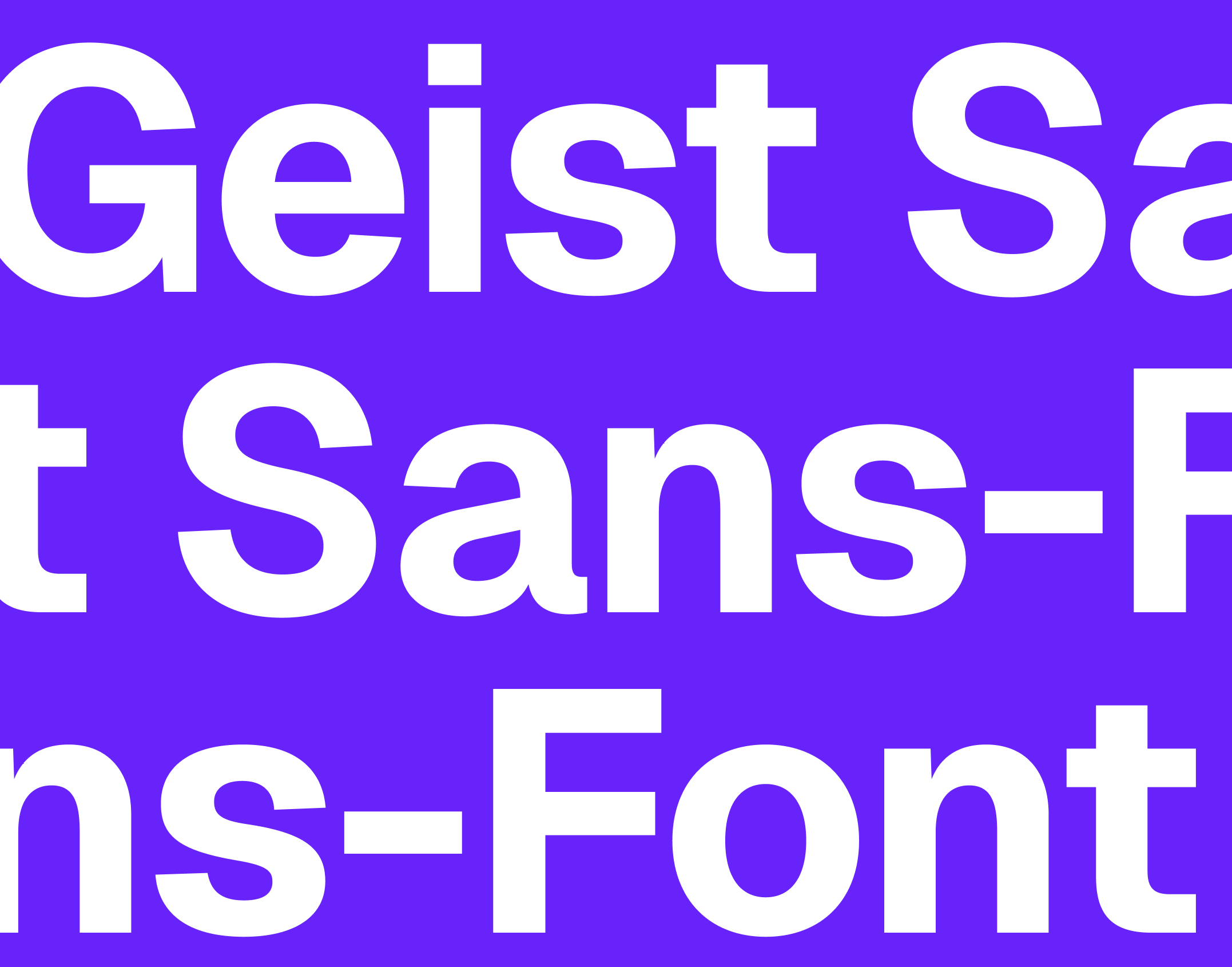
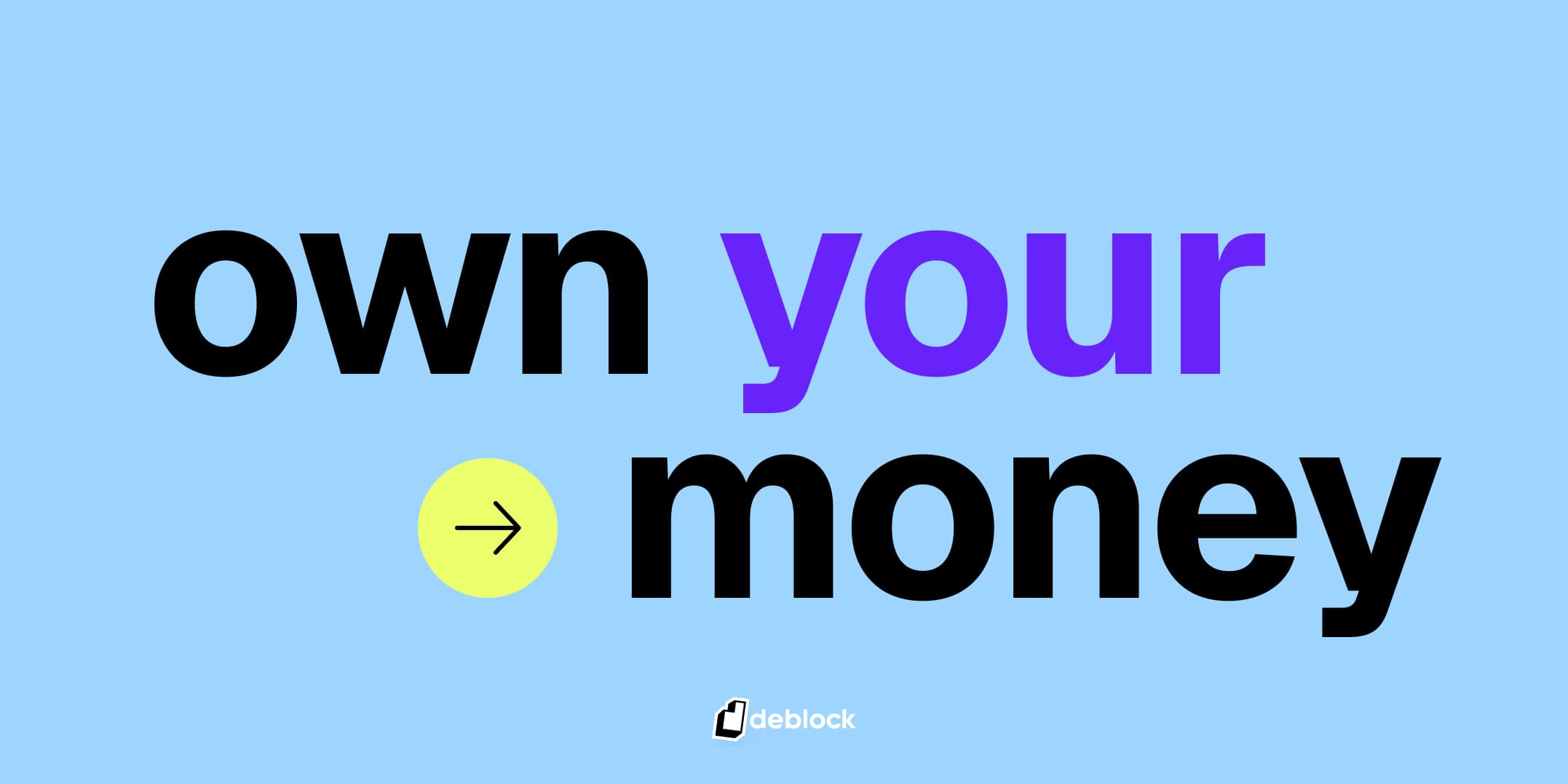
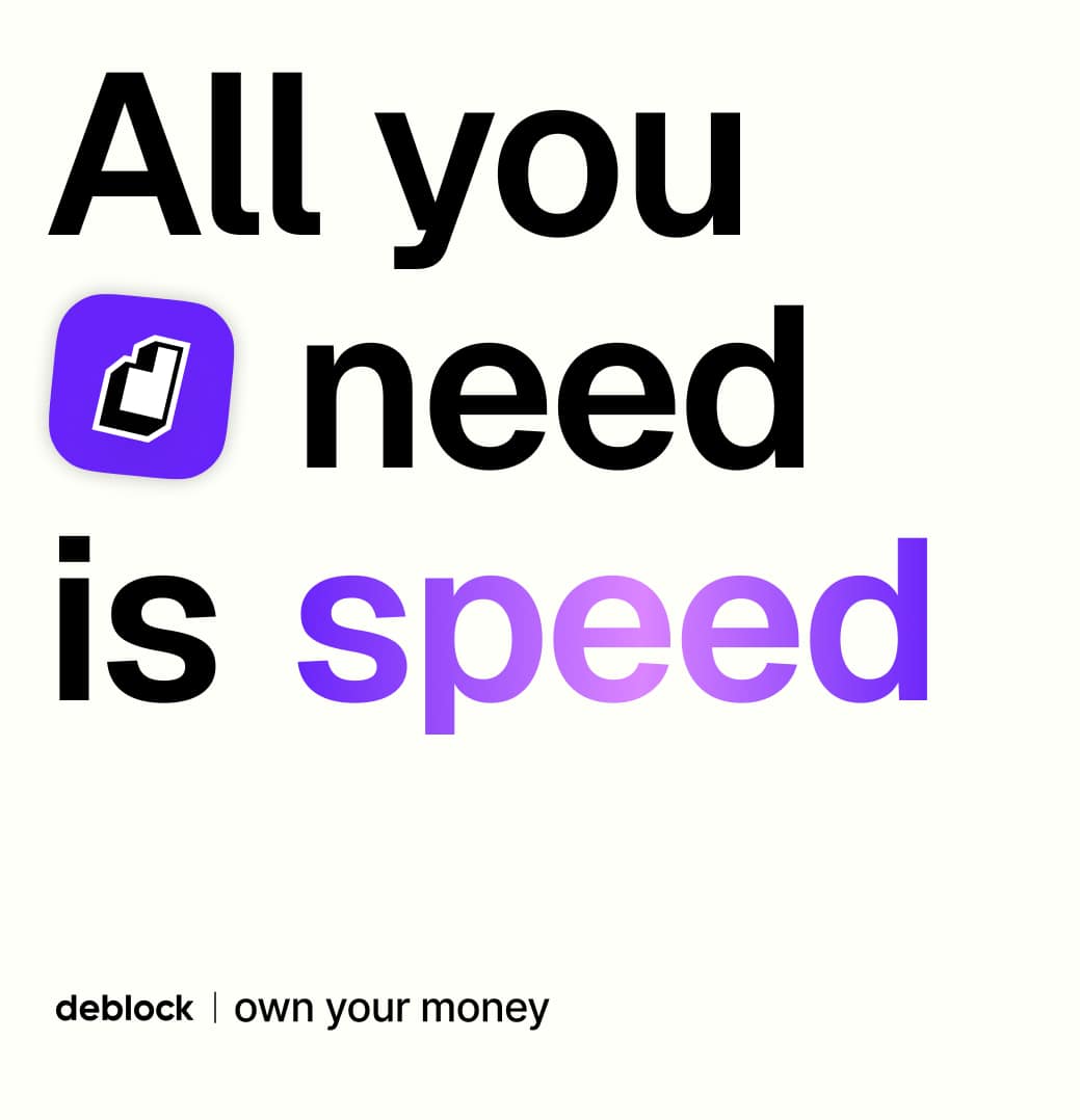
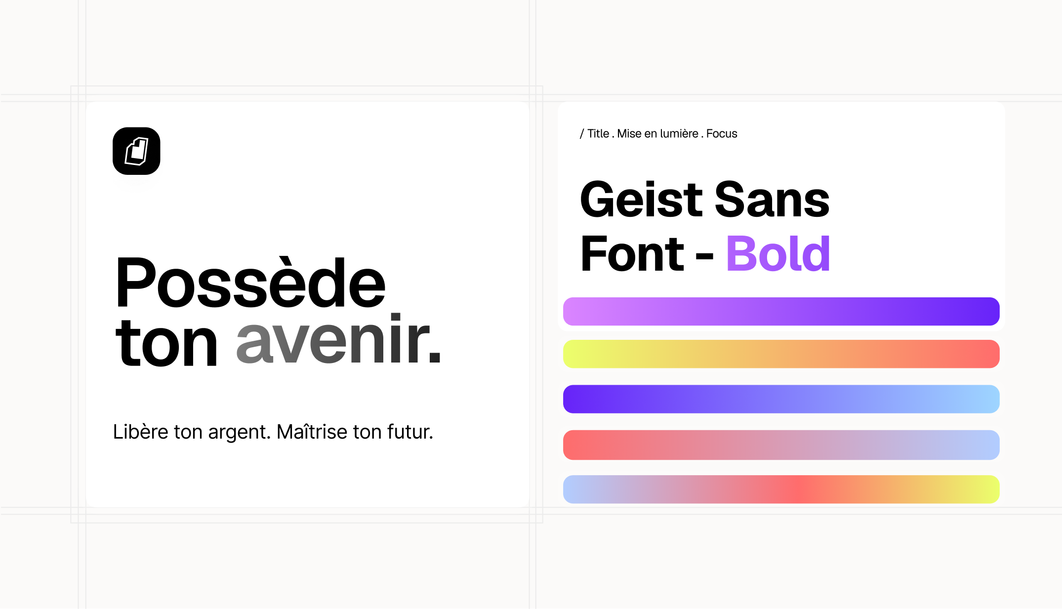
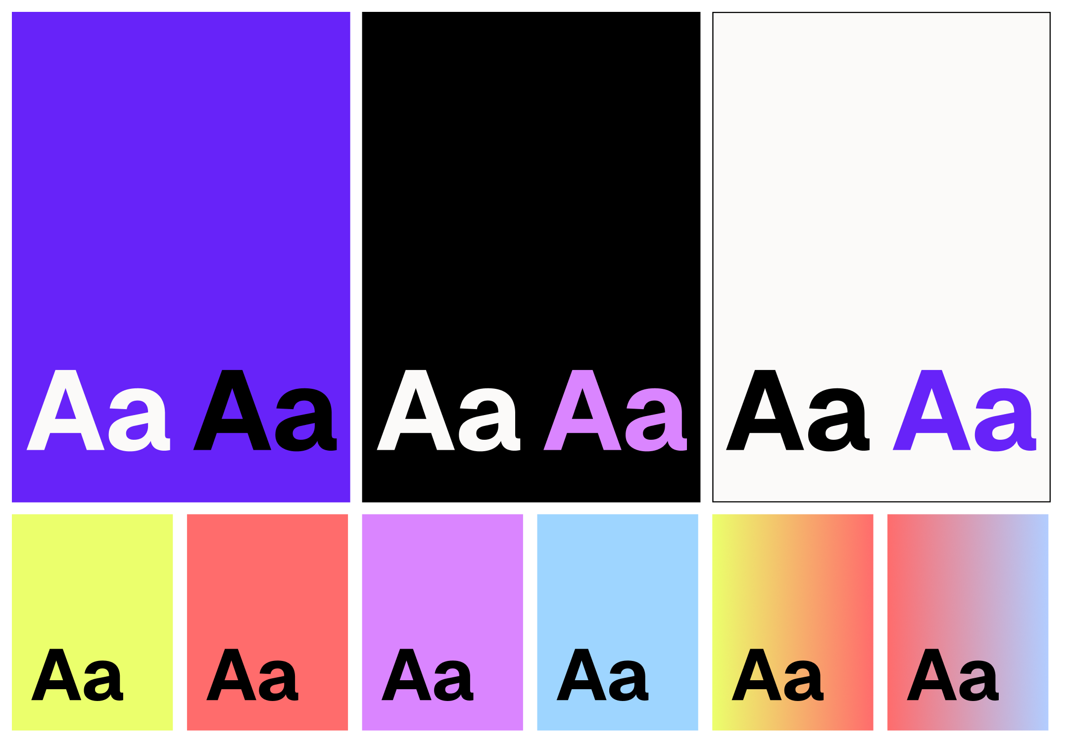
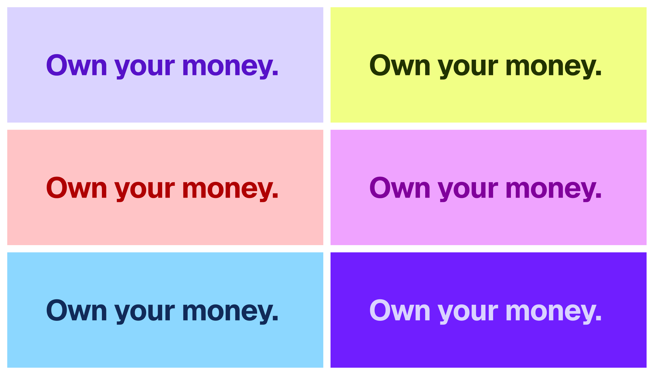
Geist Sans is the primary typeface of Deblock.

It is used for headlines, key messages, and brand expressions.

Its sharp, contemporary design reflects Deblock’s tech-driven and sovereign positioning.

Geist Sans brings impact without excess.

https://fonts.google.com/specimen/Geist

Secondary typeface

Inter is used as a supporting typeface.
It is designed for readability and performance, making it ideal for body copy, interfaces, and data-heavy environments.
Inter ensures clarity at all sizes and across all screens.

https://fonts.google.com/specimen/Inter

In use

Typography should feel calm, confident, and readable.

Layouts favor space, rhythm, and alignment.


Text is never decorative, it is always purposeful.

Do's and Don'ts

Here, you can see examples of how we use our variable typeface within the brand system.

Do's

  • Use Geist Sans for headlines and key brand messages
  • Use Inter for body copy and interfaces
  • Maintain clear hierarchy and spacing
  • Prioritize legibility at all sizes
  • Use bold weights with intention
  • Keep typography simple and structured

Don’t

  • Mix too many typefaces
  • Distort, stretch, or modify the fonts
  • Use decorative or novelty typefaces
  • Apply excessive effects or styling
  • Reduce contrast or readability
  • Let typography compete with content

Color & Typography

Color and typography work together to ensure clarity and impact.

Tone through type

Deblock typography is direct and precise.


Short statements.


Clear messages.


No unnecessary effects.


Typography speaks with authority, not volume.